
New Design for the Custom software
solutions for enterprise
elas.


Latest projects
Some of my other stuff


New Design for the Custom software
solutions for enterprise
elas.
Imagining Safety feature with mixed reality glass

SafeVision MBTA
Your Music, Your Culture
Imagine Radio

Background
Elas is a powerful platform that provides custom software solutions for enterprises, focusing on building complex ERP systems to improve efficiency and streamline operations. By combining traditional methods with modern technology, Elas helps businesses adapt to changing needs.
Elas is already trusted by top projects like LaGuardia Airport, California High-Speed Rail, Las Vegas Stadium, Apple Campus 2, and the Golden Gate Bridge. it has supported 200,000 sessions, helped 4,500 teams and their customers


*Image Source:Barefoot TEFL Teacher)

The Problem
77% of construction projects face delays due to inefficient management tools
The construction industry is plagued by delays, miscommunication, and inefficiencies due to fragmented and outdated project management systems. Despite advancements in digital tools, many construction teams struggle with complex workflows, poor collaboration, and a lack of real-time data access, leading to significant setbacks
Challange
Hard to Navigate, Slow to Use
Construction teams need a streamlined and user-friendly platform to manage projects efficiently. The challenge was to simplify complex workflows, improve navigation, and reduce cognitive load, ensuring that users could complete tasks quickly and accurately.
solution
Made navigation easier to find things quickly
Users can now find key project actions faster with a structured sidebar
Prioritized frequently used sections, making them easily accessible.
How might i enhance the Elas dashboard to minimize navigation confusion and improve usability?
solution
Simplified complex tasks, reducing completion time.
Users now add team members in as easy as possible.
Reduced manual data entry by introducing pre-filled templates.


My Role
I was the UX/UI Designer for this project, responsible for enhancing the usability and efficiency of the Elas dashboard to improve construction project management workflows.
WORK PROTECTED BY NDA
Due to confidentiality agreements, I’m unable to share detailed designs or the full process for this project. However, I’d be happy to discuss my role, approach of the Elas design—just reach out!
Design Update
How i update that design?

The Process
Impact
Key Outcomes
The new design significantly reduced cognitive load by streamlining navigation and simplifying workflows.The redesign resulted in a 62% faster user onboarding process, a 40% improvement in task discoverability, and reduced errors through structured navigation.
Process
To tackle the challenges of Elas, I followed a structured design process, from research to iteration. Here’s how I approached the redesign


Targer Audience
Who Uses Elas?
Primary Users: Construction Project Managers & Administrators
Manage users, assign tasks, track progress, and approve timesheets.
Secondary Users: Site Supervisors & Executives
Submit reports, approve budgets, and monitor KPIs.
Tertiary Users: Team Members (Engineers, Subcontractors
Log work hours, submit timesheets, and complete assigned tasks.
To better understand the challenges users faced on the old Elas platform, i applied the "5W and H" framework. This helped us focus our research by asking key questions.
Start with "5W and H" framework (Who, What, Where, When, Why, and How)


Questions
User Interviews
I conducted semi-structured interviews with 5 professionals across different roles in the construction industry.
What are your daily tasks on Elas?
What challenges do you face while managing tasks and reports?
How do you track project progress and approvals?
What features do you use the most, and which ones feel unnecessary?
What slows down your workflow or causes frustration?
Those interviews gives me to identify four significant pain points.
Hard to navigate menus
1
Users struggled to find key actions due to cluttered top navigation.
Simple tasks like timesheet approvals required too many steps
Time-Consuming Workflows
2
Tracking project progress and pending reports wasn’t straightforward.
Lack of Visibility
No pre-filled templates and automation slowed down task completion.
Manual Data Entry Issues
4
3
Research
User Persona & Journey Map
Based on my insights, I created personas to better connect with the users I would be designing for.
I assigned users tasks such as creating new “email templates” on the settings page and adding new users to the platform from the "Manage My Org" section and record their behaviors .
“I spend too much time just finding the right section to approve reports. It should be more intuitive and faster." –
Project Manager


Issue #1
Overcrowded Interface with Information Overload
During testing, 75% of users experienced confusion when interacting with the dashboard for the first time. We identified that the excessive cognitive load, caused by information overload and lack of clear prioritization, significantly slowed down task completion.
Issue #2
Complex and Inefficient Navigation
About 80% of users became frustrated and confused trying to remember and process a large amount of information at once. The overwhelming layout and lack of clear organization increased cognitive load, making navigation difficult and slowing down task completion

Finding
User Stories
"As a site supervisor, I want to submit reports and approve timesheets on-site, so that I can keep project documentation up to date without wasting time."
Problem Found
And i found 2 major key issues
from the assigned task and from think a loud protocol i found key issuess
During think a loud protocol
Extraneous cognitive load
Intrinsic Load (Too Hard to Understand)
User are getting through
The screen is too crowded with information, making it hard to focus.
The menu is confusing, so users take longer to find what they need.
Too many details make their brain work harder than it should.
Users had to process a lot of details simultaneously, making it hard to retain information
The system required too much mental effort just to complete basic tasks.
They need to do extra thinking just to figure out simple actions.
Competitive Audit
Where Construction Management Falls Short—And How Elas Can Fix It
To better understand industry standards and identify opportunities for Elas, I analyzed leading construction management platforms. My research aimed to:
Identify key features that enhance usability and task efficiency.
Pinpoint gaps where existing solutions fail to meet user expectations


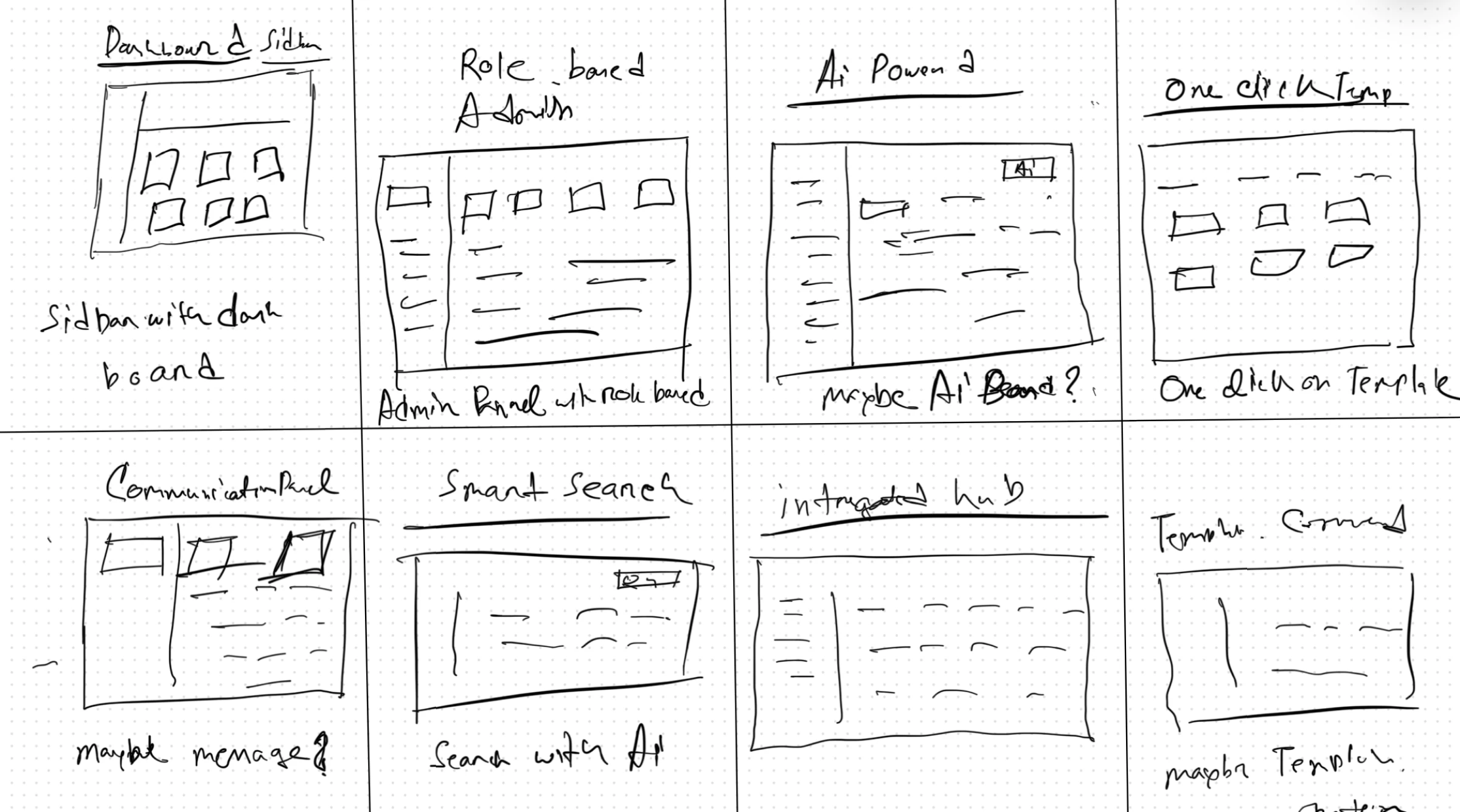
Start with Crazy 8
and collaborated with stakeholders to understand their thoughts, goals, and current user flow. This helped me improve the information architecture for a more intuitive experience.
design direction
How might i simplify workflows and reduce cognitive load?
Gap
Identifying the Market Gap
None of the competitors offer a truly seamless experience combining efficient user onboarding, customizable workflows, and intuitive role-based controls.
After identifying this market gap, I revisited my user research and key pain points. then i began exploring how to use these insights to shape my design.

COMPETITIVE AUDIT
TAKEAWAYS
Based on the competitive audit, I analyzed the strengths and weaknesses of major platforms:
Procore
+ Strength: Comprehensive document management & reporting.
- Weakness: Steep learning curve, making onboarding complex.
Buldertrend
+ Strength: Mobile-first approach with real-time team updates.
- Weakness: Overloaded interface, causing cognitive overload for new users.
Autodesk Construction Cloud
+ Strength: Seamless integration with 3D modeling & BIM workflows.
- Weakness: Expensive for small teams, making accessibility a concern.
ViewPoint
+ Strength: Strong data analytics & forecasting tools.
- Weakness: Outdated UI, requiring multiple clicks for basic functions.


Prototype
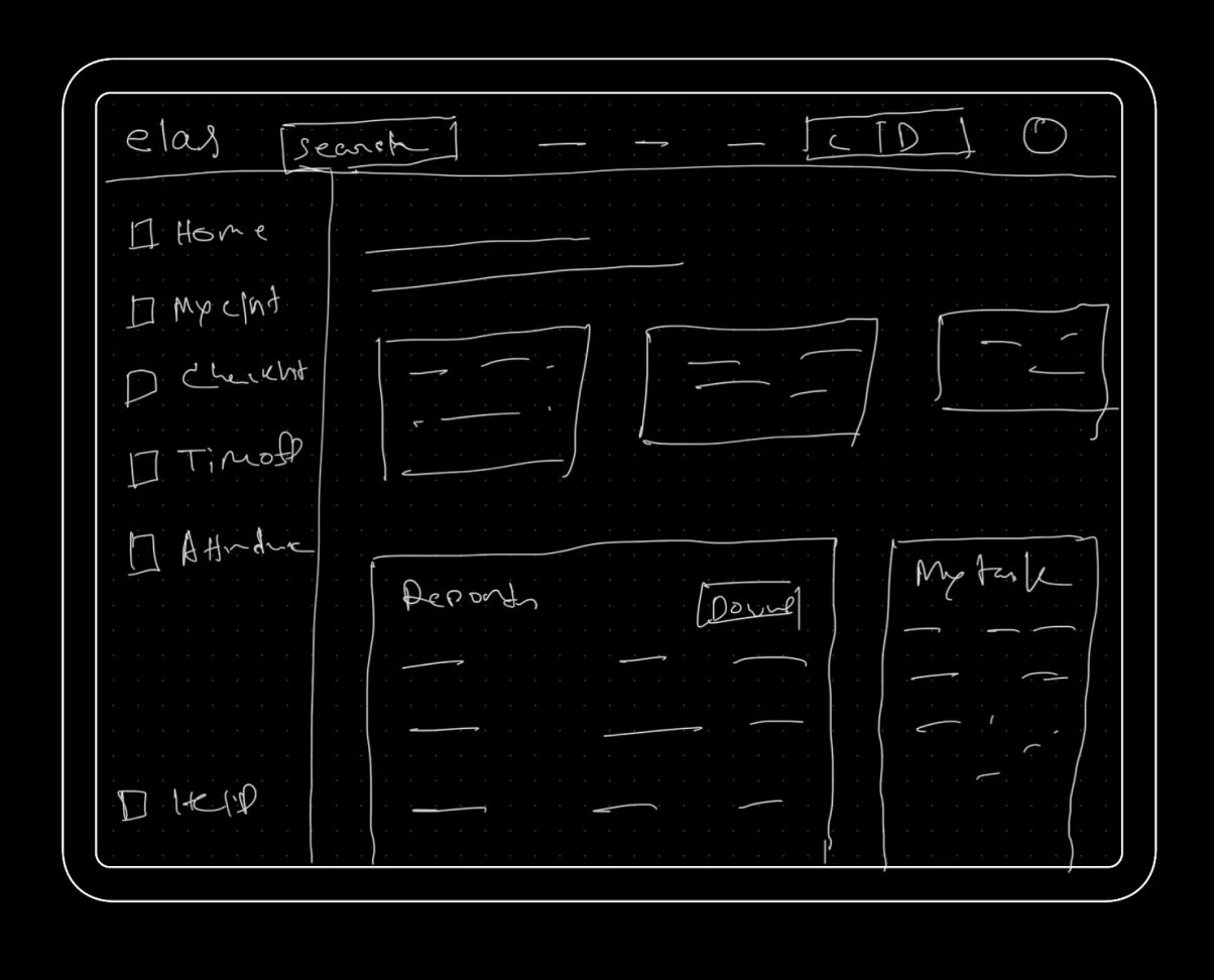
Low Fidelity Prototype
To validate early design decisions, I conducted usability testing with low-fidelity wireframes. The goal was to assess navigation efficiency, task discoverability, and overall usability before moving to high-fidelity designs.
Ideation
Start with Rough Sketch
To address usability challenges, I explored multiple layout concepts through rough sketches. The primary focus was on streamlining navigation, improving task discoverability,
The project was handover by the end of 2024. The new website is live.
What I learned.
Mental Models Matter
Users prefer interfaces that align with familiar patterns from other platforms. Observing their behavior helped me realize that adapting to existing mental models improves usability.
User Interviews are Key
Direct user feedback revealed pain points I hadn’t considered. Watching users struggle with unfamiliar layouts reinforced the importance of designing for intuition, not assumptions.
Iterate Based on Real Behavior
What seemed logical in wireframes didn’t always translate well in real-world use. Testing and refining based on user expectations helped bridge the gap between design intent and usability.
What i could have done better?
Sustained Impact on the Project
Due to my transition to higher education, I couldn't stay longer to drive more design improvements. With continued involvement, I could have iterated further, ensuring the best user experience through ongoing testing.
validation
Results and Impact
Added easy-to-use filters and a clear "Add New Reports" button to simplify report management and improve usability.
Add subtle colors to improve focus and reduce cognitive load.

Usability testing
Testing
I conducted unmoderated usability studies via Zoom, where participants completed guided tasks.
and I observed their interactions, took notes, and used pattern identification, insight identification, and affinity diagramming to uncover common themes.

Observation
Patterns Identified:
Users prefer sidebar navigation over hide top tabs for better discoverability.
Bulk user management is expected, with CSV upload or multi-user selection.
Role labels are unclear, causing hesitation in assigning permissions.
Observation
Insight Identified:
Implement a sidebar layout for easier navigation
Add bulk user actions to streamline onboarding.
Clarify role permissions with tooltips or descriptions.
Iterations
Major improvements in my design
Based on my insights from usability testing, I iterated my design to better meet user needs. I adjusted some design to make navigation more intuitive. Here are a couple of iterations that significantly improved my design.

Users struggled with top navigation; sidebar layout proved more intuitive.
Updated design prioritizes frequently used sections
Iteration 1
Refined Navigation for
Enhanced Efficiency

1
2
3
4
Switched from a top cluttered bar to Sidebar and add role base control so user can switch form their role. Also to improve discoverability and reduce time taken to access information
Added easy-to-use filters and a clear "Add New Reports" button to simplify report management and improve usability.
Easy Universal Search Function and client to organization switch
Add subtle colors to improve focus and reduce cognitive load.


Easy Drag-and-Drop Functionality: Users can seamlessly move tasks between different columns, allowing for quick updates on task progress.
Multiple View Options: Users can switch between Board, List, Calendar, and Files views based on their workflow preferences.
Iteration 2
Task Management for Better Clarity and Efficiency
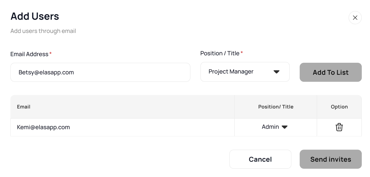

Bulk user addition now supports team-based invites and CSV uploads, streamlining onboarding.
Users can switch between single, team, and bulk invites, improving flexibility.
Iteration 3
User Management
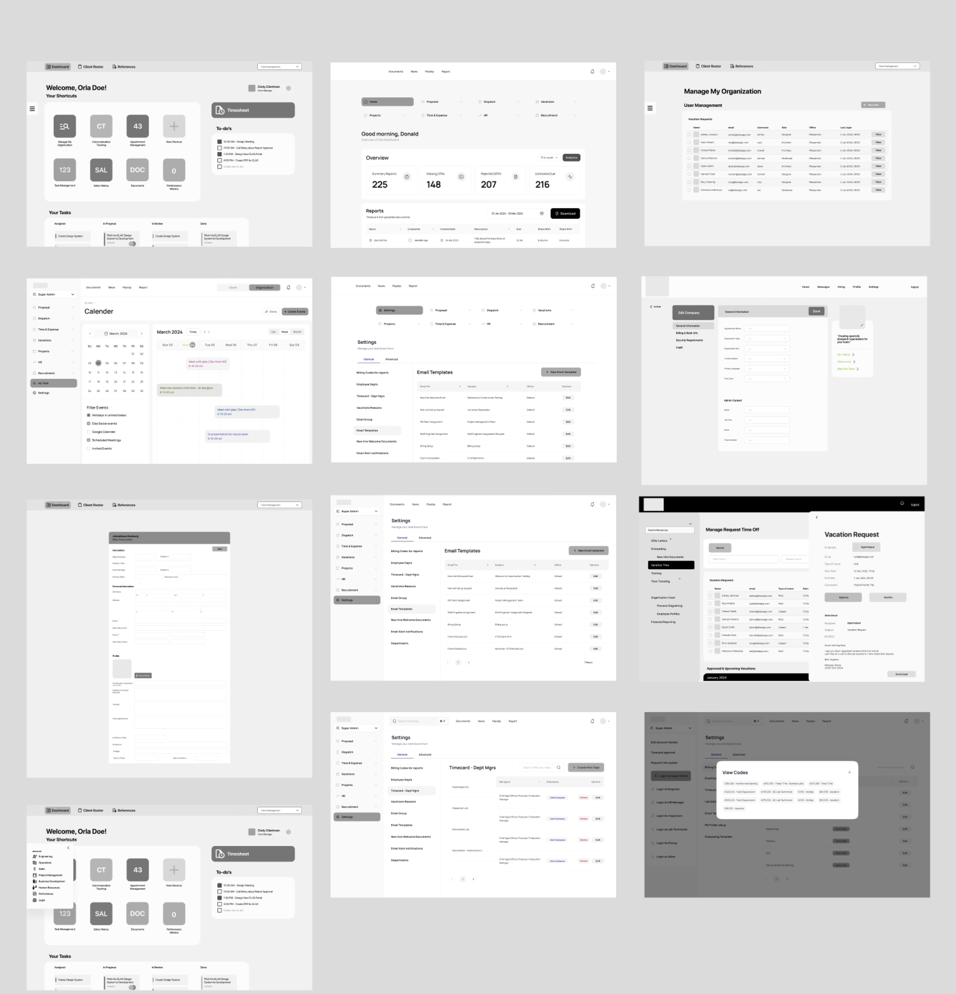
Final Design
Final Validation Before Development
Before handing off the design for development, I conducted another round of usability testing to measure how well the refined design performed.
Final Design
Key Improvements
Improved Task Discoverability – Users found key actions 40% faster with the structured sidebar compared to the cluttered top navigation.
Reduced Cognitive Load – Clearer information hierarchy and better spacing helped users focus on important tasks without visual overload.
I crafted the new Elas home page to better reflect the brand's vision and enhance user engagement. Starting from scratch, the design prioritizes clarity and modern aesthetics while ensuring seamless navigation. The headline, "Automation, your way," conveys the core message, paired with visuals that resonate with the target audience.
Design
New Website from Scratch
Ner website


I also established a detailed style guide that standardizes font styles, sizes, and weights for headings, body text, and other typography elements. This ensures visual hierarchy and readability across all pages.

Final Design
Simplified complex tasks, reducing completion time.
Users now add team members in 3 steps instead of 8, reducing form completion time by 62%..

Design
Design System and Style Guide
Final Product
Final Design
Before
After

Reimagining visits for patients
and healthcare professionals in clinical trials
New Design the Custom software
solutions for enterprise
New Design the Custom software
solutions for enterprise
New Design the Custom software
solutions for enterprise
SafeVision MBTA
elas.
elas.
elas.
Latest projects
Some of my other stuff
Some of my other stuff
Some of my other stuff
Some of my other stuff
New Design for the Custom software
solutions for enterprise
elas.
Music Platform for Bengali People
Imagine Radio
Background
Elas is a powerful platform that provides custom software solutions for enterprises, focusing on building complex ERP systems to improve efficiency and streamline operations. By combining traditional methods with modern technology, Elas helps businesses adapt to changing needs.
Elas is already trusted by top projects like LaGuardia Airport, California High-Speed Rail, Las Vegas Stadium, Apple Campus 2, and the Golden Gate Bridge. it has supported 200,000 sessions, helped 4,500 teams and their customers
The Problem
77% of construction projects face delays due to inefficient management tools
The construction industry is plagued by delays, miscommunication, and inefficiencies due to fragmented and outdated project management systems. Despite advancements in digital tools, many construction teams struggle with complex workflows, poor collaboration, and a lack of real-time data access, leading to significant setbacks
How might i enhance the Elas dashboard to minimize navigation confusion and improve usability?
Challange
Hard to Navigate, Slow to Use
Construction teams need a streamlined and user-friendly platform to manage projects efficiently. The challenge was to simplify complex workflows, improve navigation, and reduce cognitive load, ensuring that users could complete tasks quickly and accurately.
solution
Restructured navigation, improving task discoverability.
Users can now find key project actions 40% faster with a structured sidebar
Prioritized frequently used sections, making them easily accessible.
solution
Simplified complex tasks, reducing completion time.
Users now add team members in 3 steps instead of 8, reducing form completion time by 62%..
Reduced manual data entry by introducing pre-filled templates.
Impact
Key Outcomes
The new design significantly reduced cognitive load by streamlining navigation and simplifying workflows.The redesign resulted in a 62% faster user onboarding process, a 40% improvement in task discoverability, and reduced errors through structured navigation.
My Role
I was the UX/UI Designer for this project, responsible for enhancing the usability and efficiency of the Elas dashboard to improve construction project management workflows.
Process
To tackle the challenges of Elas, I followed a structured design process, from research to iteration. Here’s how I approached the redesign
WORK PROTECTED BY NDA
Due to confidentiality agreements, I’m unable to share detailed designs or the full process for this project. However, I’d be happy to discuss my role, approach of the Elas design—just reach out!
Design Update
How i update that design?
Start with "5W and H" framework (Who, What, Where, When, Why, and How)
To better understand the challenges users faced on the old Elas platform, i applied the "5W and H" framework. This helped us focus our research by asking key questions.
Targer Audience
Who Uses Elas?
Primary Users: Construction Project Managers & Administrators
Manage users, assign tasks, track progress, and approve timesheets.
Secondary Users: Site Supervisors & Executives
Submit reports, approve budgets, and monitor KPIs.
Tertiary Users: Team Members (Engineers, Subcontractors
Log work hours, submit timesheets, and complete assigned tasks.
“I spend too much time just finding the right section to approve reports. It should be more intuitive and faster." –
Project Manager
What are your daily tasks on Elas?
What challenges do you face while managing tasks and reports?
How do you track project progress and approvals?
What features do you use the most, and which ones feel unnecessary?
What slows down your workflow or causes frustration?
Questions
User Interviews
I conducted semi-structured interviews with 5 professionals across different roles in the construction industry.
Those interviews gives me to identify four significant pain points.
Hard to navigate menus
1
Users struggled to find key actions due to cluttered top navigation.
Simple tasks like timesheet approvals required too many steps
Time-Consuming Workflows
2
3
Tracking project progress and pending reports wasn’t straightforward.
Lack of Visibility
No pre-filled templates or automation slowed down task completion.
Manual Data Entry Issues
4
Research
User Persona & Journey Map
Based on my insights, I created personas to better connect with the users I would be designing for.
I assigned users tasks such as creating new “email templates” on the settings page and adding new users to the platform from the "Manage My Org" section and record their behaviors .
Finding
User Stories
"As a site supervisor, I want to submit reports and approve timesheets on-site, so that I can keep project documentation up to date without wasting time."
During think a loud protocol
Problem Found
And i found 2 major key issues
from the assigned task and from think a loud protocol i found key issuess
Issue #1
Overcrowded Interface with Information Overload
During testing, 75% of users experienced confusion when interacting with the dashboard for the first time. We identified that the excessive cognitive load, caused by information overload and lack of clear prioritization, significantly slowed down task completion.
Issue #2
Complex and Inefficient Navigation
About 80% of users became frustrated and confused trying to remember and process a large amount of information at once. The overwhelming layout and lack of clear organization increased cognitive load, making navigation difficult and slowing down task completion
*Image Source:Barefoot TEFL Teacher)
*Image Source:Barefoot TEFL Teacher)
Extraneous cognitive load
Intrinsic Load (Too Hard to Understand)
User are getting through
The screen is too crowded with information, making it hard to focus.
The menu is confusing, so users take longer to find what they need.
Too many details make their brain work harder than it should.
Users had to process a lot of details simultaneously, making it hard to retain information
The system required too much mental effort just to complete basic tasks.
They need to do extra thinking just to figure out simple actions.
COMPETITIVE AUDIT
Efficiency & Usability in Construction Management Platforms
To better understand industry standards and identify opportunities for Elas, I analyzed leading construction management platforms. My research aimed to:
Identify key features that enhance usability and task efficiency.
Pinpoint gaps where existing solutions fail to meet user expectations
Start with Crazy 8
and collaborated with stakeholders to understand their thoughts, goals, and current user flow. This helped me improve the information architecture for a more intuitive experience.
design direction
How might i simplify workflows and reduce cognitive load?
Gap
Identifying the Market Gap
None of the competitors offer a truly seamless experience combining efficient user onboarding, customizable workflows, and intuitive role-based controls.
After identifying this market gap, I revisited my user research and key pain points. I then began exploring how to use these insights to shape my design.
COMPETITIVE AUDIT
TAKEAWAYS
Based on the competitive audit, I analyzed the strengths and weaknesses of major platforms:
Procore
+ Strength: Comprehensive document management & reporting.
- Weakness: Steep learning curve, making onboarding complex.
Buldertrend
+ Strength: Mobile-first approach with real-time team updates.
- Weakness: Overloaded interface, causing cognitive overload for new users.
Autodesk Construction Cloud
+ Strength: Seamless integration with 3D modeling & BIM workflows.
- Weakness: Expensive for small teams, making accessibility a concern.
ViewPoint
+ Strength: Strong data analytics & forecasting tools.
- Weakness: Outdated UI, requiring multiple clicks for basic functions.
Ner website
I crafted the new Elas home page to better reflect the brand's vision and enhance user engagement. Starting from scratch, the design prioritizes clarity and modern aesthetics while ensuring seamless navigation. The headline, "Automation, your way," conveys the core message, paired with visuals that resonate with the target audience.
Design
New Website from Scratch
Ideation
Start with Rough Sketch
To address usability challenges, I explored multiple layout concepts through rough sketches. The primary focus was on streamlining navigation, improving task discoverability,
Usability testing
Testing
I gathered participants for unmoderated usability studies via zoom. Each participant received a set of guided tasks
and I took notes on how they were completed.
I then used pattern identification, insight identification, and affinity diagramming to identify common themes.
Observation
Patterns Identified:
Users prefer sidebar navigation over hide top tabs for better discoverability.
Bulk user management is expected, with CSV upload or multi-user selection.
Role labels are unclear, causing hesitation in assigning permissions.
Observation
Insight Identified:
Implement a sidebar layout for easier navigation
Add bulk user actions to streamline onboarding.
Clarify role permissions with tooltips or descriptions.
Users struggled with top navigation; sidebar layout proved more intuitive.
Updated design prioritizes frequently used sections
Iteration 1
Refined Navigation for
Enhanced Efficiency

Iteration 2
Task Management for Better Clarity and Efficiency
Easy Drag-and-Drop Functionality: Users can seamlessly move tasks between different columns, allowing for quick updates on task progress.
Multiple View Options: Users can switch between Board, List, Calendar, and Files views based on their workflow preferences.
Bulk user addition now supports team-based invites and CSV uploads, streamlining onboarding.
Users can switch between single, team, and bulk invites, improving flexibility.
Iteration 3
User Management

Final Design
Key Improvements
Improved Task Discoverability – Users found key actions 40% faster with the structured sidebar compared to the cluttered top navigation.
Reduced Cognitive Load – Clearer information hierarchy and better spacing helped users focus on important tasks without visual overload.
Final Design
Simplified complex tasks, reducing completion time.
Users now add team members in 3 steps instead of 8, reducing form completion time by 62%..
Final Product
Final Design
Design
Design System and Style Guide
The project was handover by the end of 2024. The new website is live.
What I learned.
Mental Models Matter
Users prefer interfaces that align with familiar patterns from other platforms. Observing their behavior helped me realize that adapting to existing mental models improves usability.
User Interviews are Key
Direct user feedback revealed pain points I hadn’t considered. Watching users struggle with unfamiliar layouts reinforced the importance of designing for intuition, not assumptions.
Iterate Based on Real Behavior
What seemed logical in wireframes didn’t always translate well in real-world use. Testing and refining based on user expectations helped bridge the gap between design intent and usability.
What i could have done better?
Sustained Impact on the Project
Due to my transition to higher education, I couldn't stay longer to drive more design improvements. With continued involvement, I could have iterated further, ensuring the best user experience through ongoing testing.
Latest projects